Design 03Enterprise Tools · Usability

Making the mundane  and difficult interesting  and easy.

Programming a device with one button turns out to be brutally complicated. 123Scan² made that job direct, clear, and supported — for a one-store owner and a fleet technician at the same time.

Org
Motorola Solutions
Role
Design lead
Year
123Scan²
Discipline
Enterprise software
Context

Tools for deploying devices en masse.

While at Motorola Solutions I worked on a series of tools that enabled enterprises to manage, program, and deploy industrial computer tools en masse and remotely. 123Scan² did exactly that for industrial and retail barcode scanners.

Notably, it is amazing how complicated it is to program a device that only has one interface element: a trigger button — and some do not even have that.
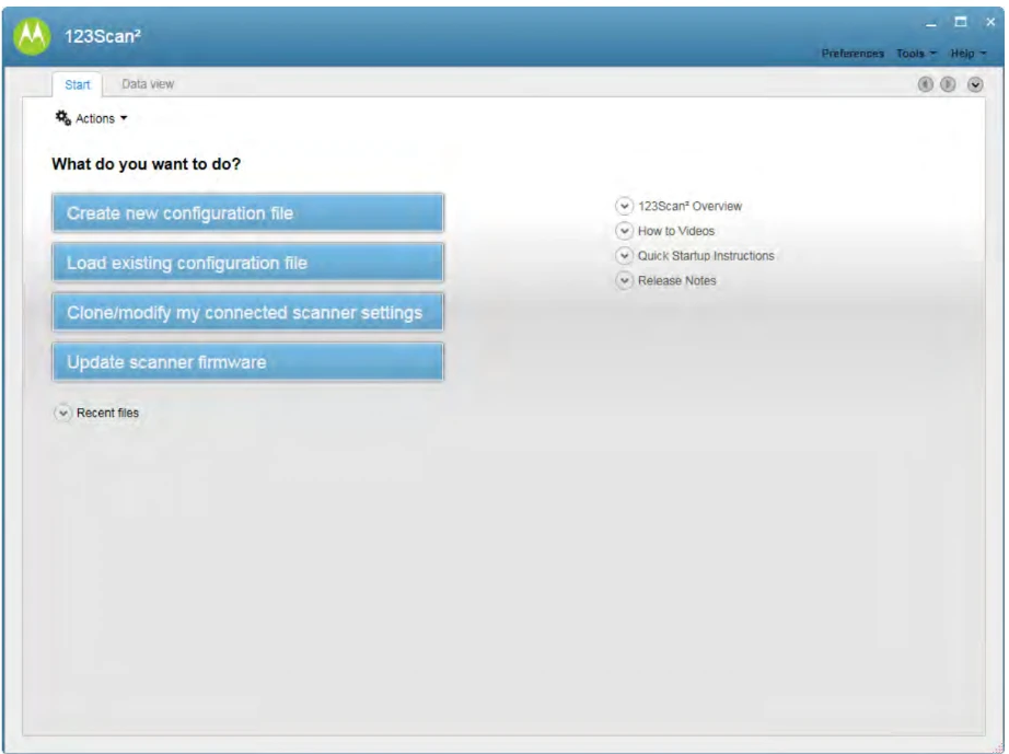
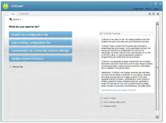
123Scan² Start screen with four primary task buttons and a help panel
Start screen. The tool was designed to work for people running Mom & Pop shops as well as for highly technical enterprise deployments — and this screen worked for both. It had a limited engagement footprint and put the most-used everyday tasks right up front. The design of the “Start” area was task driven.
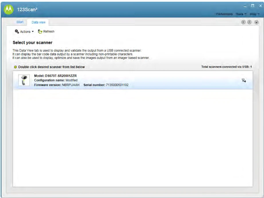
123Scan² Data view screen listing connected scanners with model, configuration and firmware detail
Data view. Built for power users: every scanner attached to the system, presented so the technician gets a very object-oriented perspective of their management duties.
Craft

Direct, clear, and supported.

We designed 123Scan² to be clean, clear, responsive, and well supported. Built on WPF/.NET4 using Expression Blend, the design team was able to hand the development group almost production-ready thick-client assets, with high-fidelity interactions, transitions, and animations.
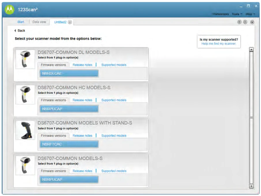
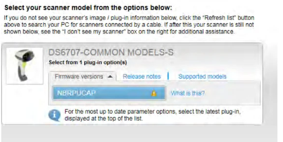
123Scan² device selection screen showing scanner models with photos, firmware versions and plug-in options
Select a device (disconnected). You need to know what type of scanner you are programming for, and what version of software it's running. Operators know this, but it's usually presented in a way they can't act on. Adding pictures and clear buttons and labels made the difference — usability testing and interviews showed this more graphical design engaged and satisfied.
123Scan² view for a connected device with a single scanner model and firmware options
View for a connected device. Selecting a device you know is connected is much easier, and it's the normal flow for operators. The same widget is reused for code redundancy, presenting only a subset with clear text instruction.
123Scan² Start screen with an inline help and video tutorial panel open on the right
Help is never far away. Inline help arrives with the alert icon and the “What is this?” link, and the Start screen carries text help and video tutorials. We were not shy of text.
The move
One screen, two audiences

A task-driven Start screen served the corner-store owner and the enterprise technician without forking the product.

The move
Show the device

Photos of scanner models turned an unactionable model-number list into a decision operators could actually make.

The move
Hand off runnable assets

WPF and Expression Blend let design deliver near-production thick-client interactions instead of redlines.

Leadership Principles

How this maps to leadership principles.

  • Customer Obsession: the design started from what operators already knew and couldn't act on, not from the device spec.
  • Invent and Simplify: a one-button device's configuration space got reduced to four everyday tasks up front.
  • Insist on the Highest Standards: high-fidelity, near-production assets went to engineering rather than static comps.
  • Learn and Be Curious: usability testing and interviews decided the graphical direction, not internal taste.
← Previous · Design 02

The New Digital Studio

Next · Design 04

Rich Internet Apps bring desktop design to the web