Bringing the art forward for a design school.
Brought in as an outside consultant to mentor a young UX team and lead research, strategy, and execution. The problem areas were brand, findability, and strategic engagement. The result was nominated for a Webby in Education.
- Org
- Savannah College of Art and Design
- Role
- Consultant · UX lead & mentor
- Year
- SCAD.edu redesign
- Discipline
- Higher-ed web platform
Put the students on the homepage.
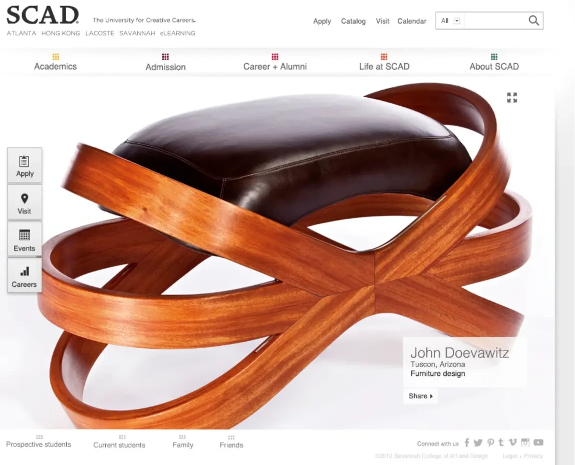
SCAD's strategy is to reinforce its commitment to being a student-centered institution. So the homepage became a full-bleed stage for student excellence — one piece of student work, credited by name, program, and city.
That image is also the engagement hook: students and their friends can share it directly, which turns institutional marketing into student pride.
Navigation the users own.
Analytics said findability was the biggest issue. After a series of card-sorting exercises and reviews with content owners, we developed a core set of principles for the navigation structure — and used the research reports to convince executive stakeholders to move from an organizational model to a user-centered one.
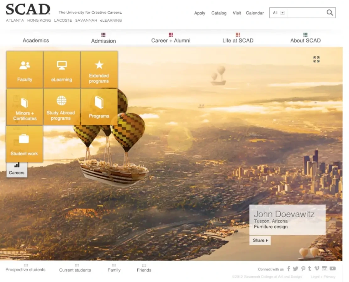
Two navigations do the work. Institutional navigation sits at the top, because that model is what users of peer institutions already expect. User-based navigation sits at the bottom and re-maps the same sections by who's asking — prospective students, current students, family, friends. Color coding across both teaches the connection between them.
Low barrier, from the get-go.
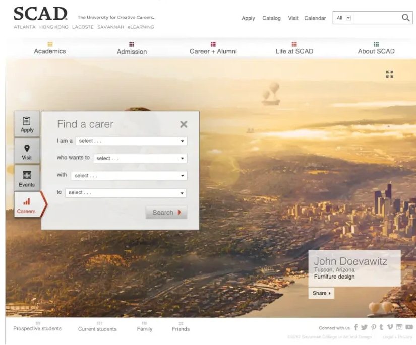
We wanted points of engagement available immediately. Executive stakeholders and site analytics together determined which four types of engagement earned a place on the homepage.
Apply made the list because applicants sourced from the website are the key success metric for the redesign. Careers made it because prospective students and their guardians are deeply concerned about employment prospects after an art and design college.
The toughest layout in the site.
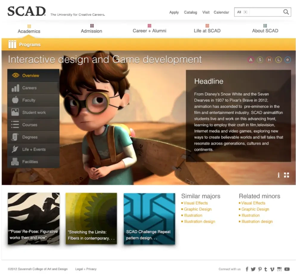
Programs was the hardest sub-section to lay out and navigate. Its reliance on high media, and its importance as the focal point for prospects, made it a primary area of focus.
Each program carries an overview, careers, faculty, student work, courses, degrees, life and events, and facilities — plus similar majors and related minors, so a prospect who lands on the wrong program still finds the right one.
The internal community's one thing.
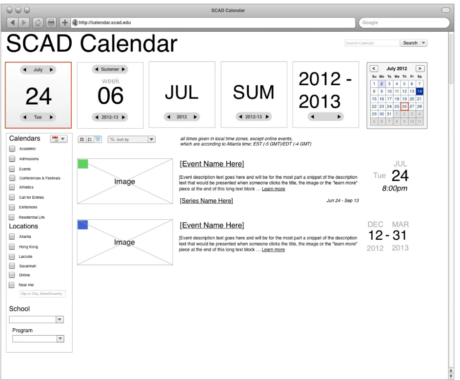
SCAD's internal community doesn't use the website often — but when they do, it's for the calendar. Research with a group of students in SCAD's HCI class found the calendar was the number one pain point for internal users. So it became one of our biggest design focuses.
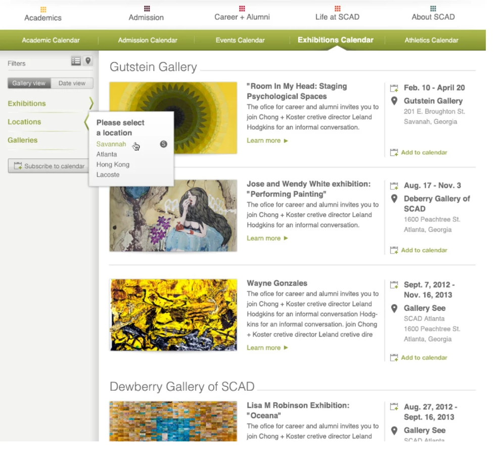
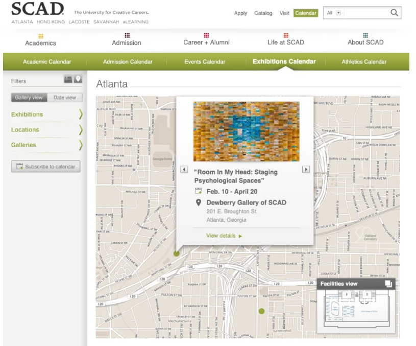
Two lessons shaped it. Time navigation in a university context is complex: the academic year differentiates time more than January 1 does, quarters and week-of-quarter matter, and all of that has to coexist with conventional calendar navigation. Filter or separate? We started with a single unified calendar, then found that people's mental models separated the groupings enough to warrant not just different calendars, but different calendar views with their own navigation, organization, and content layout.
Card sorting and analytics reporting were what convinced executives to abandon an organizational navigation model.
Institutional at the top, audience-based at the bottom, color-coded so the site teaches its own structure.
Distinct mental models earned distinct calendars — different views, navigation, and layouts, not one calendar with checkboxes.
Where it landed.
The redesigned SCAD.edu was nominated for a Webby in the Education category — and the young UX team I was brought in to mentor carried the research and navigation practice forward after the engagement ended.
How this maps to leadership principles.
- Customer Obsession: card sorting, HCI-class research, and analytics defined the navigation — not the org chart.
- Develop the Best: the engagement's real deliverable was a UX team that could run research and strategy on its own.
- Dive Deep: the calendar, the least glamorous surface, got the deepest design attention because that's where the pain was.
- Insist on the Highest Standards: student work leads every page — the brand promise had to be visible before it was readable.